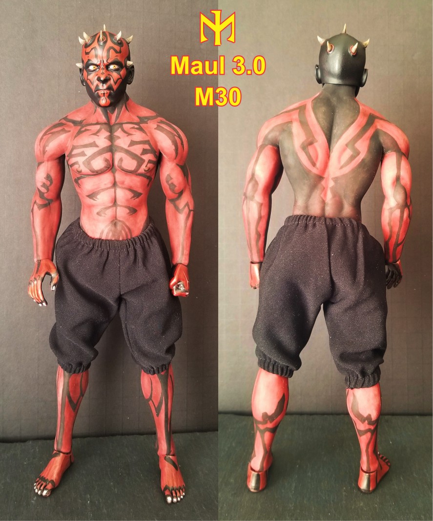
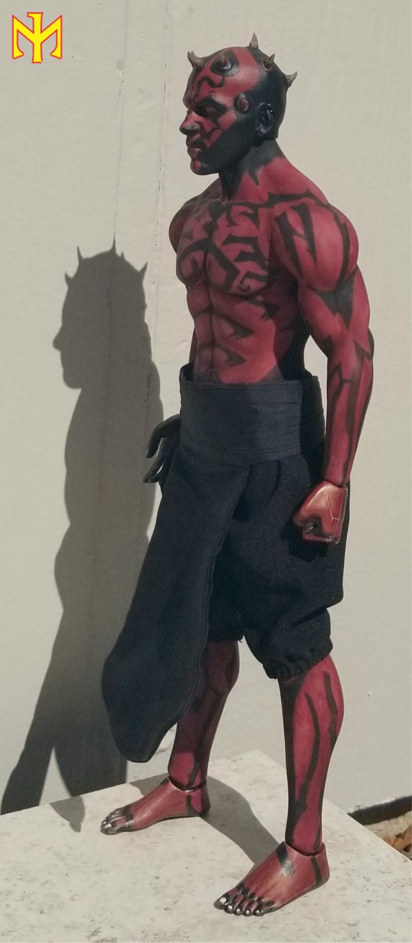
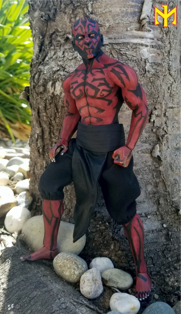
Ephiane wrote:He is absolute fantastic ! It must be a very hard Job th get the body paintings symetric to the other body side. You light sabre effects are amazing, they are better than in the older pictures. You masterd this
Thank you very much! I'm glad you like it. Yes, symmetry is a problem. Sometimes I end up having to make extra designs to match mismatching elements. Sometimes I decide to let it slide (giving it a more "organic" look).
Stryker2011 wrote:The red is so much better than the previous version (or is that partly because the color has faded a bit, as you mentioned)...? Looks really good.
Thank you very much, glad you liked it. Looking at the older photos above, I think Maul 1.0 was always less of a match and I'm not sure to what extent (if any) his base color has faded -- it does look a little messier to me, perhaps in part because I know how much effort I put into stopping the oil-based ink from transferring. Maul 2.0's base color is warmer, and that helps (certainly with the hands and feet, but even with the head). I wish it were just a little darker, but red, scarlet, and purple only got me this far -- plus I didn't want to do more damage to the chest and other areas where I was trying to blend them while ensconcing them more securely into the silicone. That's why (the resulting rougher surface) the edges of the designs there are less sharp than on Maul 1.0.


 It must be very hard to get the body paint symetrical, but You get it. Has he got a PERS ? Anyway, it´s nice to see a HS with that looks not straight. I think it´s good for posing