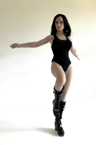
Question for those who have been using the oil pastels.... I recently coloured a tbleague body blue for an upcoming Aayla Secura figure, but was somewhat frustrated by the results. I first tried one colour, but it turned out too bright blue. Then I added some 'shading' in a darker blue colour, and now it's a bit better colourwise, but I'm worried it's too dark? Or just looks weird? I don't normally share WIP photos, but to illustrate, here's some pics....please excuse the background mess. 
[photos removed for privacy reasons]
Does it look recognizable for the character? It was the best skintone I could achieve with the materials I had at hand. Wwondering if I should have used a pale body, since maybe the original lighter blue colour would have turned out better on the first try that way? I'm not bothered about 100% screen accuracy, since I'm going for an amalgamation of various versions of this character (film, animated, comic book, etc), but I still wanted the shade/tone to be recognizable.
ETA: This is more the sort of skin colour I'd originally wanted:

I'm at one of those points where I've looked at the thing too long and can no longer really be objective, so just looking for some feedback...