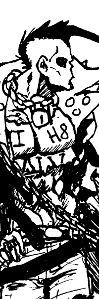
Hope this is alright to include here--it isn't my tutorial and it isn't directly related to figures, but in the short time I've been checking out the world of 1/6 dolls I've noticed a lot of people like to make comics! (Part of the reason I decided to invest in a phicen doll was for art reference tbh lol)
I've been working on my own comics hoping to be published next year, and one thing I've noticed that a lot of people take for granted is lettering! It's actually a really cool artform I've gained appreciation for after attempting it myself, and I love to share stuff with others that have helped me along the way.
You don't need any fancy art programs to do it (although they're always a perk lol), these are just some general guidelines that might be helpful when planning out and editing scenes/panels.
I am not including all of the lettering tips on the website, just the ones I think would be most helpful here--But if you are interested in reading more, everything is from Blambot.com! (They also have a great selection of fonts, a lot of which are free, and if you are serious in learning more about lettering I HIGHLY recommend their book. It's geared towards Photoshop but a lot of the technical things can be adapted to other programs.)


This page also has great general advice on the visual language of dialogue balloons. Here's a snippet:

BALLOON TAILS
"If at all possible, a balloon tail should point to a character's mouth as if an invisible line continued on past the end of the tail to their face. Pointing it in the general area of the character, (their hand, leg, etc.,) should be avoided if possible. A tail should terminate at roughly 50-60% of the distance between the balloon and the character's head."
If you have access to Illustrator, here are a couple of videos from Scott McCloud on lettering (some techniques shown in the vids are the same or similar to those in the Blambot book but the book goes into much more detail.)
(ALSO if you are interested in comic making in any form, I HIGHLY recommend Scott's books, Understanding Comics, Reinventing Comics, and Making Comics--they will revolutionize the way you think about making them. Big fan, highly recommend, 10/10.)
Hope that all makes sense--and obviously don't worry about it if you don't have the time or just don't care how your lettering looks lol, hobbies are meant to be fun, not a chore! (This just happens to be how I have fun lmao. No I do not get out often. Sunlight? What's that?)
Hope you enjoy! I can also answer any questions if you have any (or on making comics in general, though I know that's not exactly the purpose of this forum. I'm here because I wanted to make a doll of one of my characters so the topics are connected in my mind lol)
I've been working on my own comics hoping to be published next year, and one thing I've noticed that a lot of people take for granted is lettering! It's actually a really cool artform I've gained appreciation for after attempting it myself, and I love to share stuff with others that have helped me along the way.
You don't need any fancy art programs to do it (although they're always a perk lol), these are just some general guidelines that might be helpful when planning out and editing scenes/panels.
I am not including all of the lettering tips on the website, just the ones I think would be most helpful here--But if you are interested in reading more, everything is from Blambot.com! (They also have a great selection of fonts, a lot of which are free, and if you are serious in learning more about lettering I HIGHLY recommend their book. It's geared towards Photoshop but a lot of the technical things can be adapted to other programs.)
This page also has great general advice on the visual language of dialogue balloons. Here's a snippet:
BALLOON TAILS
"If at all possible, a balloon tail should point to a character's mouth as if an invisible line continued on past the end of the tail to their face. Pointing it in the general area of the character, (their hand, leg, etc.,) should be avoided if possible. A tail should terminate at roughly 50-60% of the distance between the balloon and the character's head."
If you have access to Illustrator, here are a couple of videos from Scott McCloud on lettering (some techniques shown in the vids are the same or similar to those in the Blambot book but the book goes into much more detail.)
(ALSO if you are interested in comic making in any form, I HIGHLY recommend Scott's books, Understanding Comics, Reinventing Comics, and Making Comics--they will revolutionize the way you think about making them. Big fan, highly recommend, 10/10.)
Hope that all makes sense--and obviously don't worry about it if you don't have the time or just don't care how your lettering looks lol, hobbies are meant to be fun, not a chore! (This just happens to be how I have fun lmao. No I do not get out often. Sunlight? What's that?)
Hope you enjoy! I can also answer any questions if you have any (or on making comics in general, though I know that's not exactly the purpose of this forum. I'm here because I wanted to make a doll of one of my characters so the topics are connected in my mind lol)