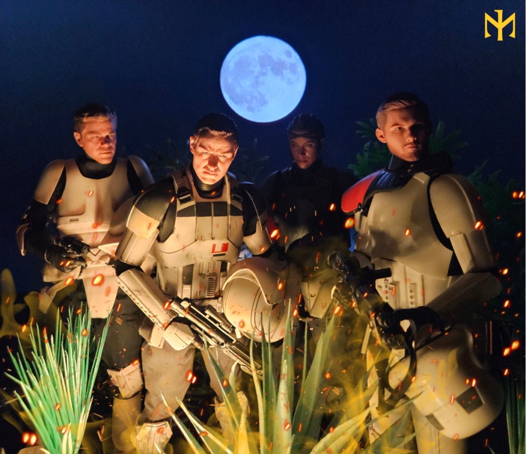
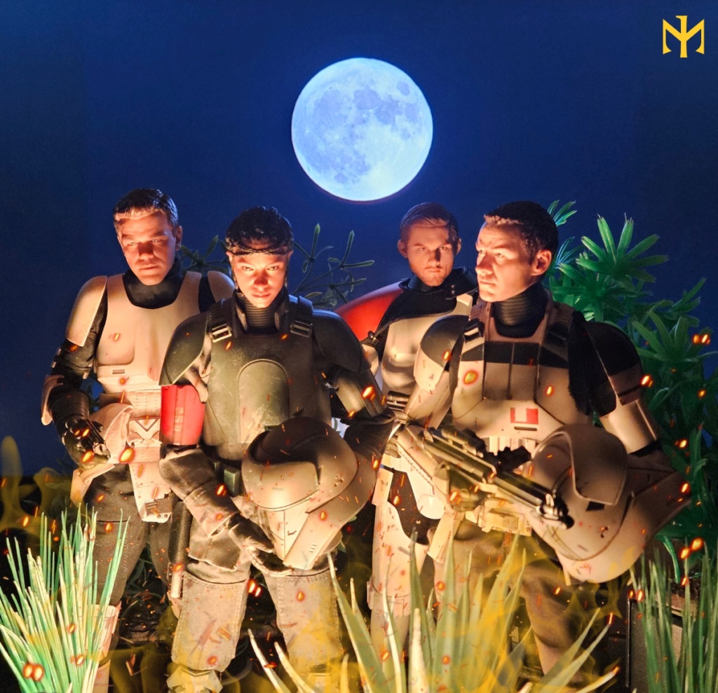
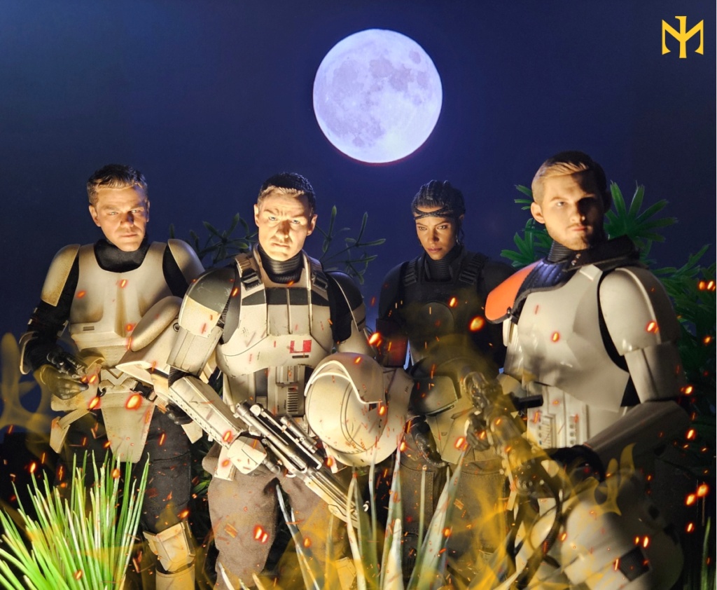
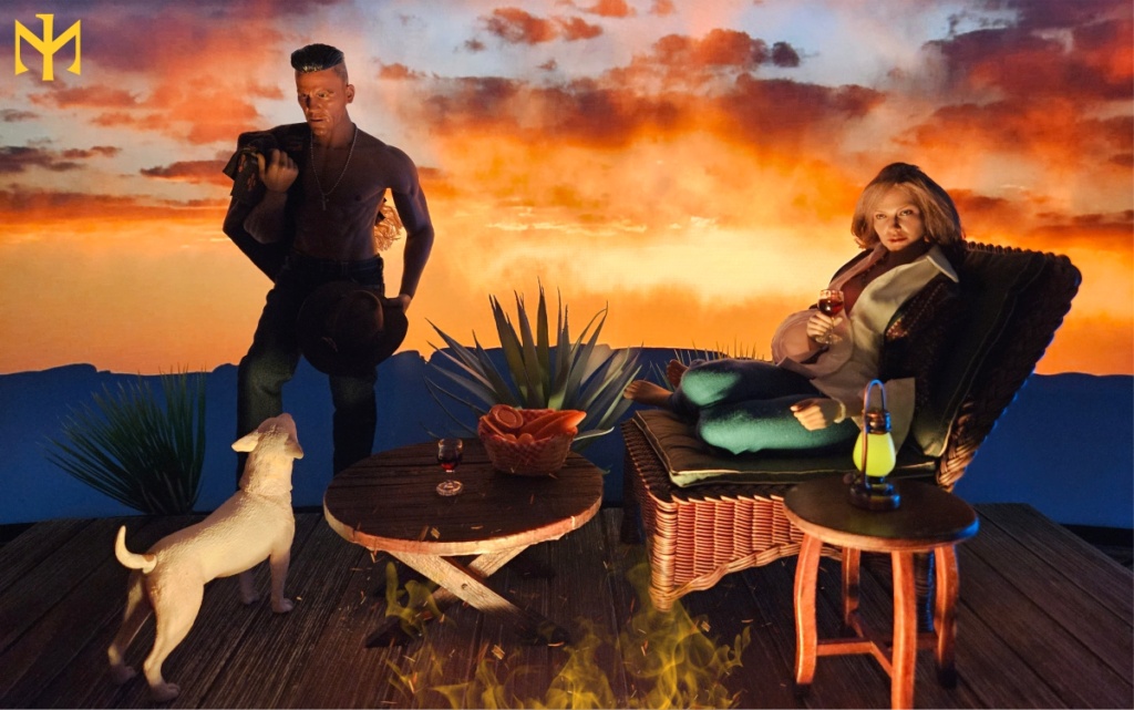
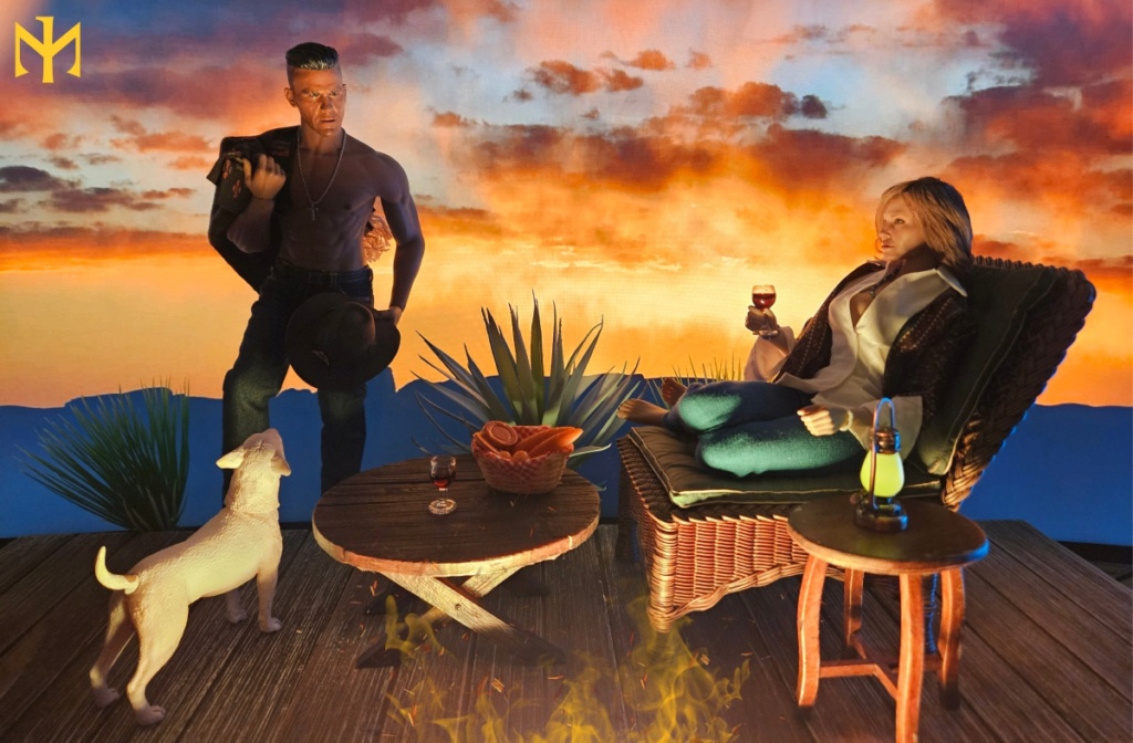
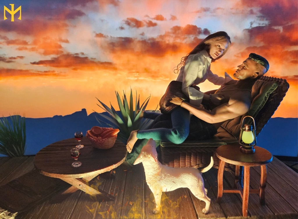
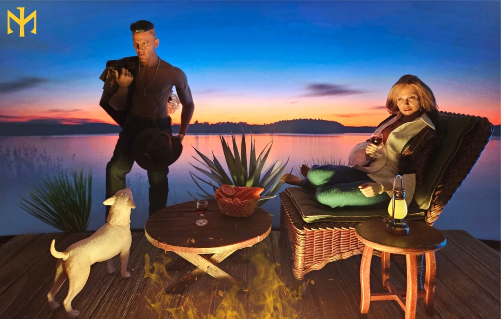
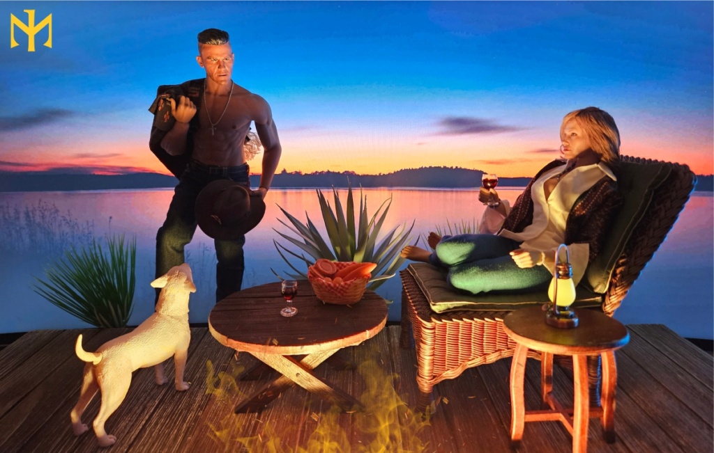
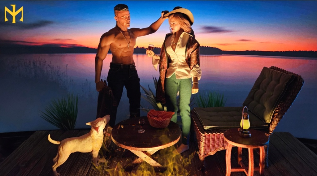
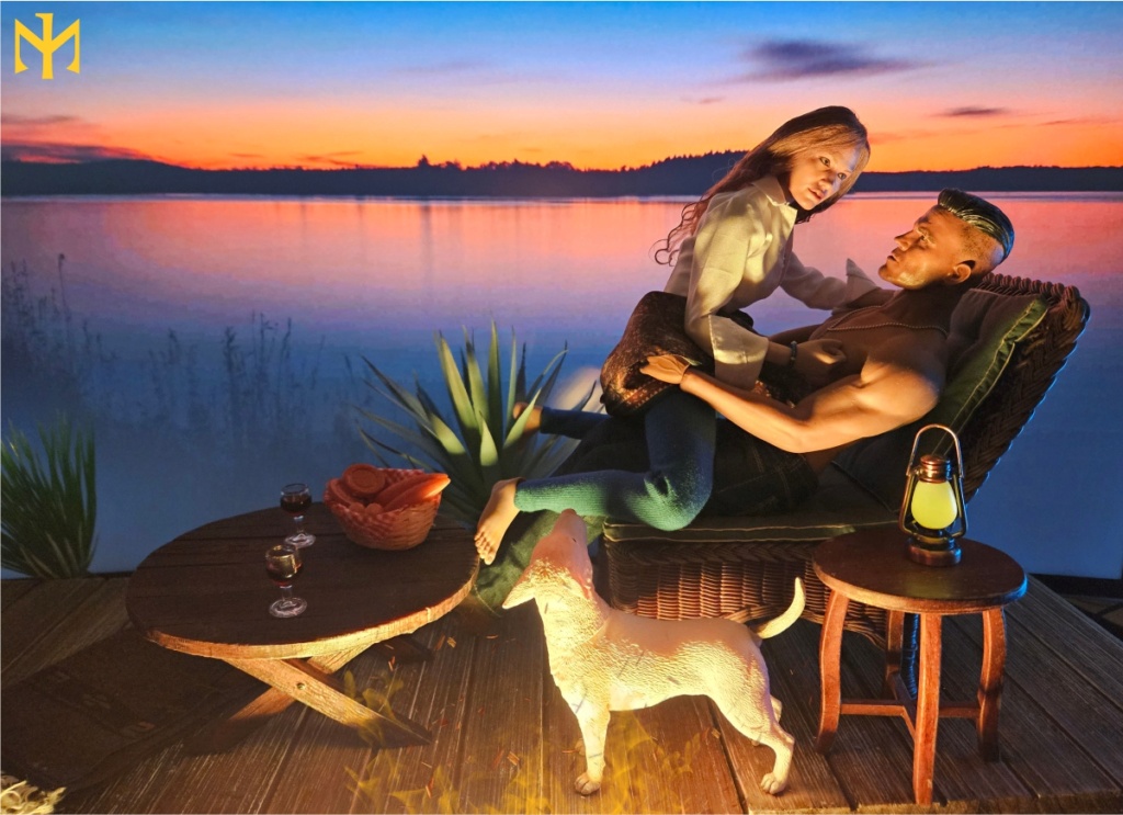
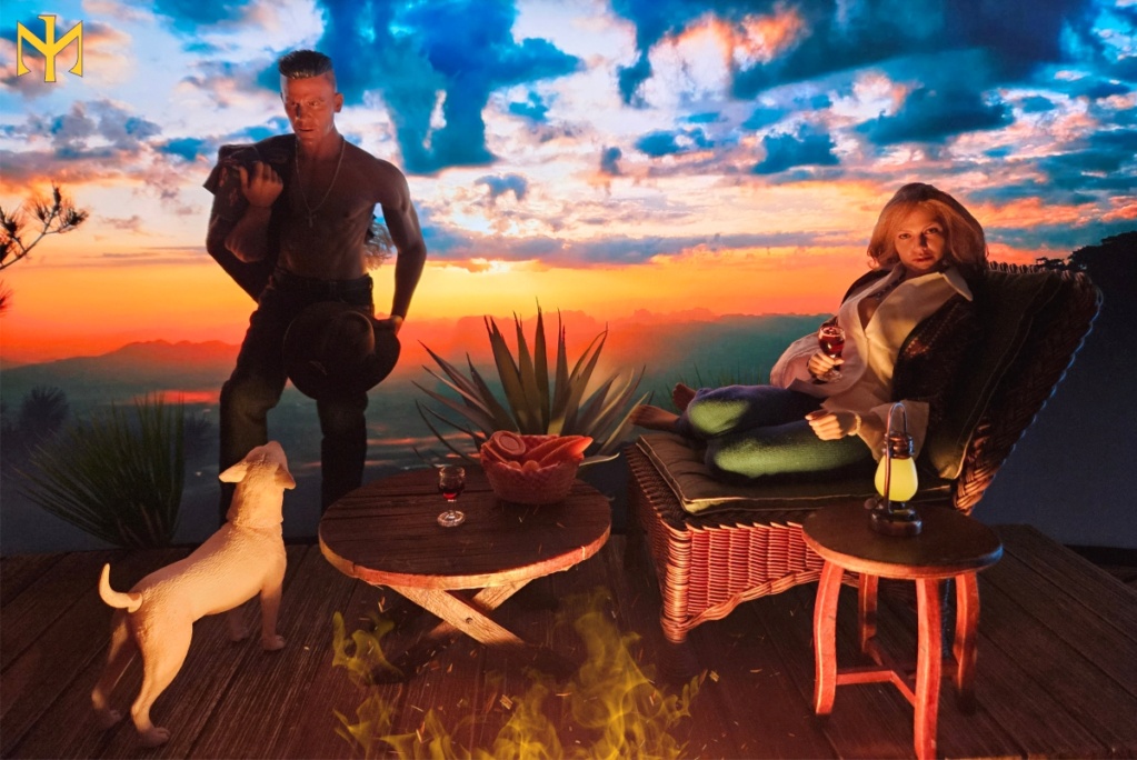
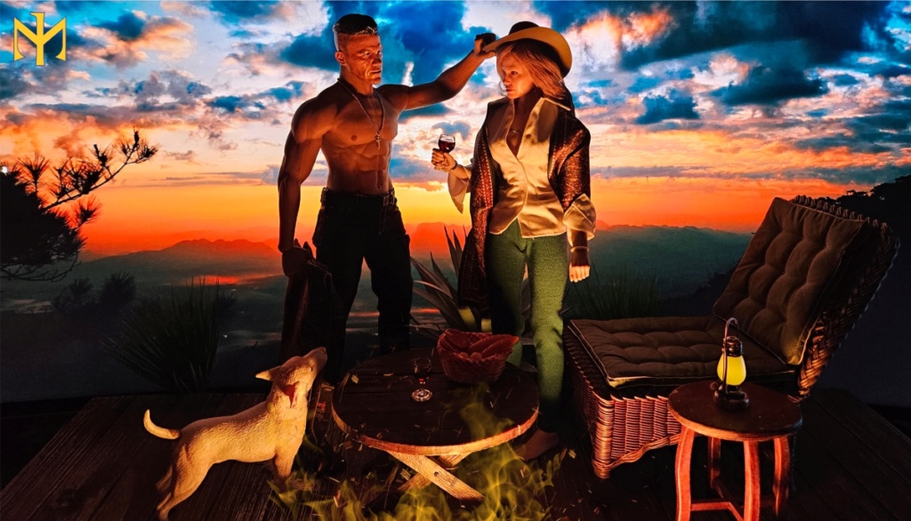
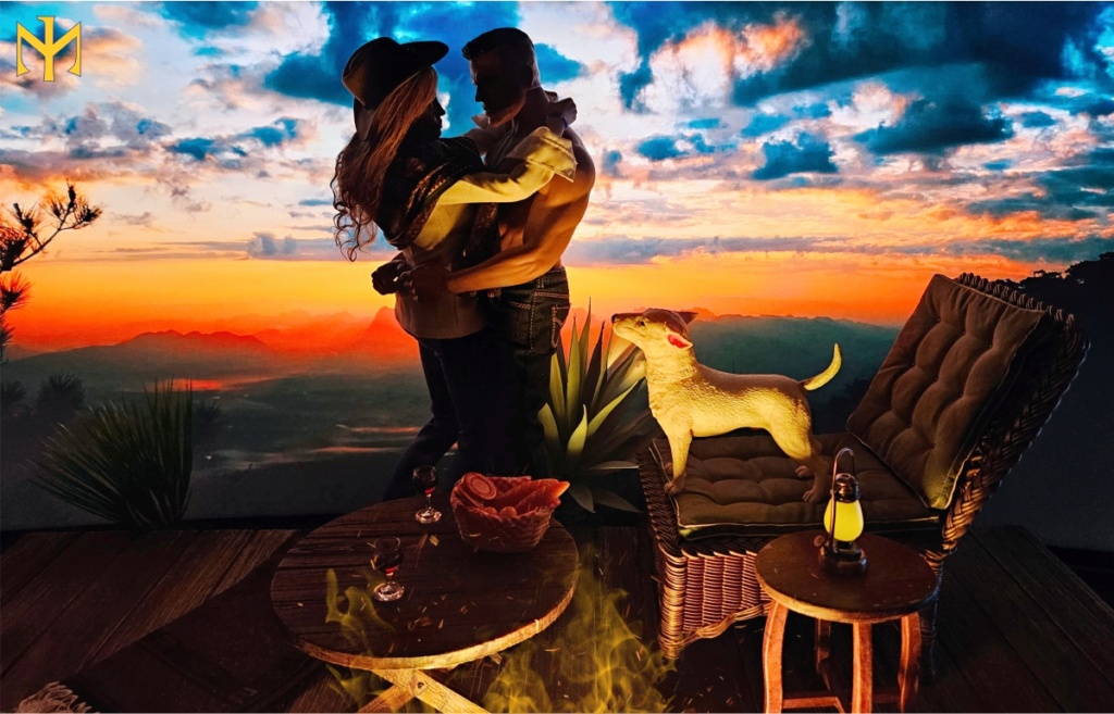
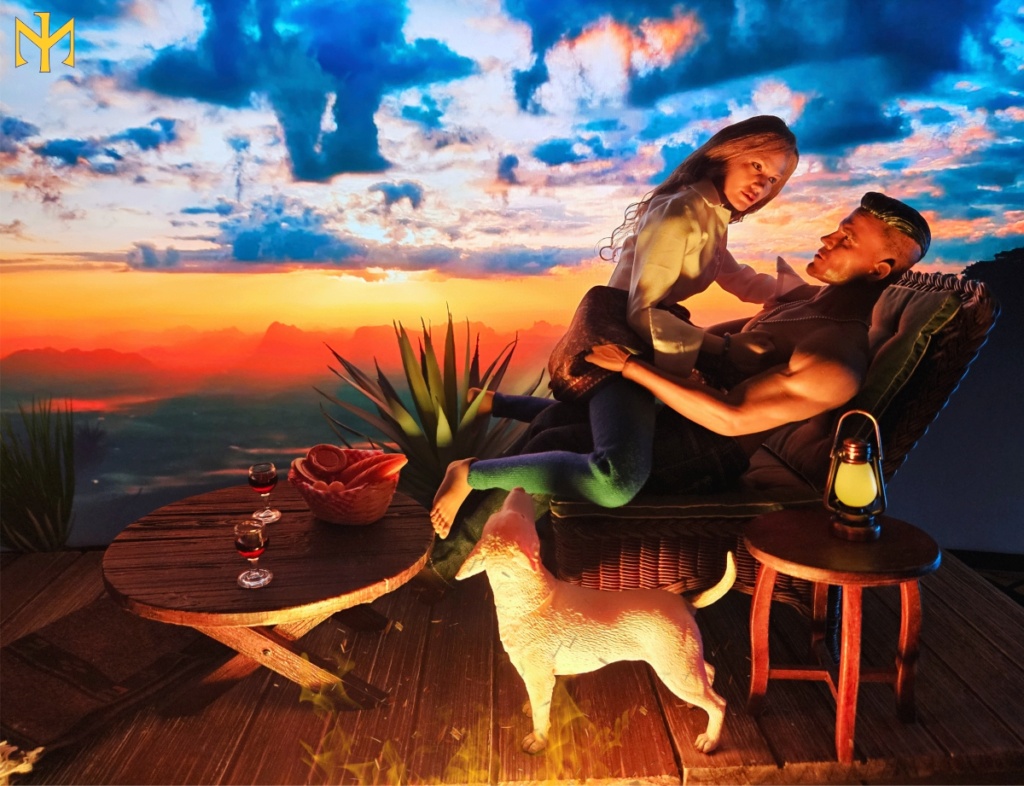
Randam Hajile wrote:Very nice, Ian! I like the last set the best, as lights and shadows fit nicely. I would have preferred a more shallow shooting angle, but I understand that the camp fire would get in the way.
I usually reduce depth of field to blur out the background slightly, as this gives the illusion of a real 3D setup. I think your picture could also profit from playing with the camera aperture or the use of a photo app to dynamically reduce sharpness in the background. Sorry for my nitpicking...

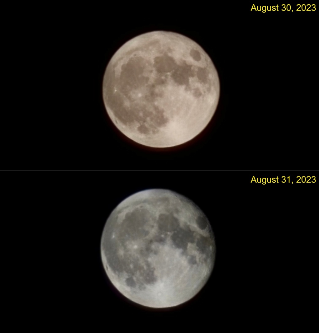
Thanks, Ralf. And no problem, I'm looking to learn, hence these experiments. I don't think I will ever reach your level of professionalism, and this is just my phone camera (although I'm sure it has plenty of settings I have not checked yet). What exactly does a more shallow shooting angle mean? From below? The screen is only this tall, so unless both figures are sitting or lying, or I'm not showing the whole of their bodies, I won't be able to fit them against the background. I agree about the focus -- usually the camera focuses on the objects in front, so the screen becomes a little more blurry, but perhaps not quite enough. I noticed, after editing, that on a couple of images, one can actually make out the raster of the screen, which I aim to avoid. This was yet another exercise in trying to use a relatively dark screen-projected background with a non-obvious front light source (and the flame and embers were added digitally).
Diana wrote:Awww, nice! Love the dog. It makes them so much more versatile when they can move their heads!
I think I like the first set the best. The clouds are just a little too busy for my liking in set 3, and the blue sky in set 2, at least in pictures one and two, is just too much.
Glad you liked the pooch. He's a recent acquisition, and I also love that he is partly articulated (head and tail).
I also thought the clouds were a bit busy, but couldn't resist trying out that gorgeous sunset. My quick search turned up remarkably few images that lent themselves to what I was trying to do.
Visisonor wrote:Nice sequence. All three of them.
The second version has monitor bezel visible on the last photo, but that can be fixed with a simple crop.
I think I prefer the first version, but can't point out why, just a feeling.
Thank you very much! And yes, I meant to crop and forgot (I did remember in the other photos). EDIT: Fixed it, and thanks again for letting me know.
BAMComix wrote:Really nice shots, Ian!
Thank you very much, Dal, glad you enjoyed them.
ElBundy wrote:I would prefer the second set. Here the spatial illusion succeeds best.
Thank you, I think you might be right. You are the master of spatial illusion.
Stryker2012 wrote:Hmmm. Hard to say. There are some excellent shots in each set, where the lighting and shadows match with the backdrop. Lots of nice touches and details. Is the dog’s head actually movable?
Thank you very much, Mark. And yes, the dog's head moves quite freely, as it is attached via a magnet. The tail is also movable, but not enough to be particularly obvious in the photos.


