Beautiful way to photograph. I'm looking forward to seeing how you get your taste for 1:6 figures.
OneSixthFigures

An online community to discuss and share news about sixth-scale figures, with an emphasis on either custom or commercial articulated figures.
Go to page :  1, 2, 3, 4
 Re: Visisonor's conjectures of grandeur (updated 2024-11-02) Mon Feb 19, 2024 5:20 pm
 Re: Visisonor's conjectures of grandeur (updated 2024-11-02) Sat Mar 02, 2024 2:56 am
Theboo-bomb wrote:Very nice! I like the lightning.
Ephiane wrote:Beautiful way to photograph. I'm looking forward to seeing how you get your taste for 1:6 figures.


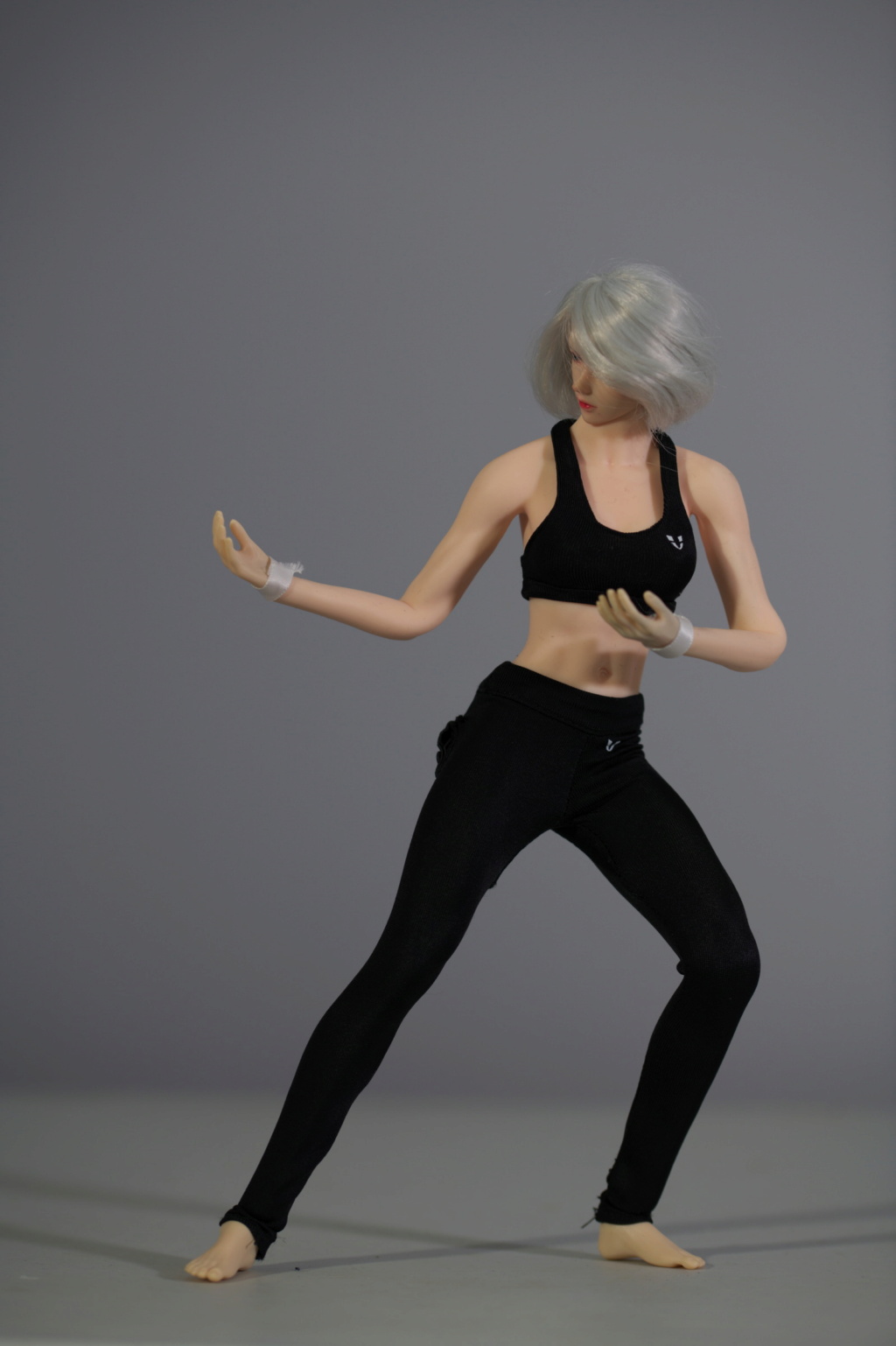



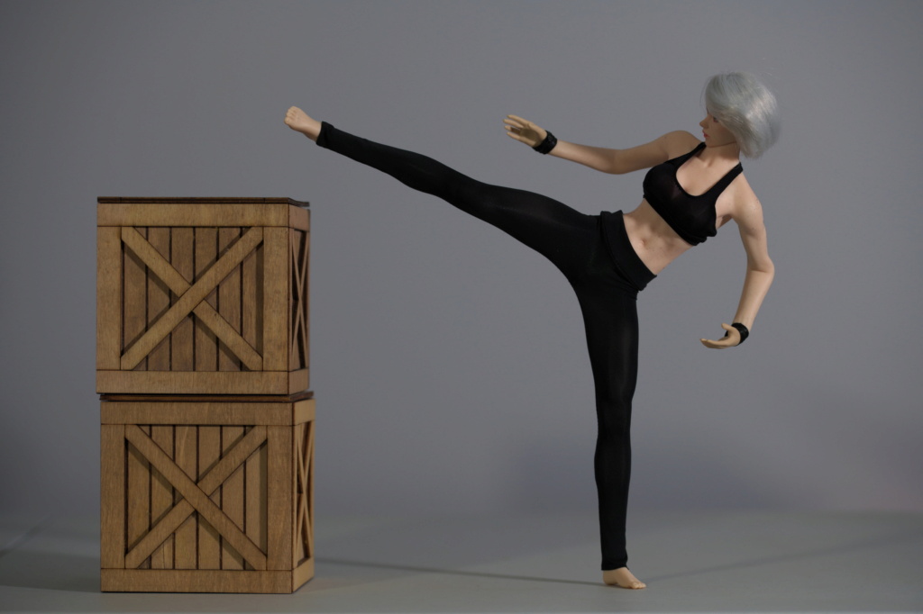
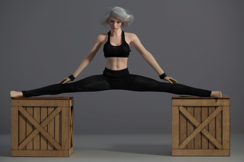

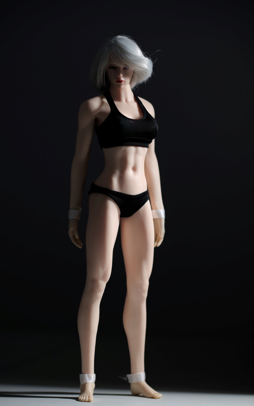
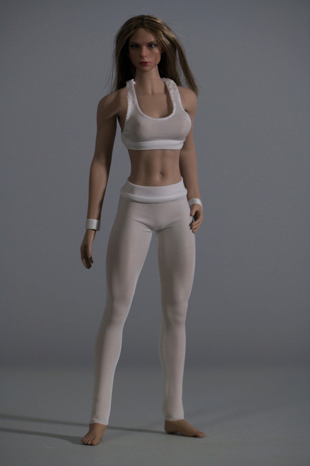




 Re: Visisonor's conjectures of grandeur (updated 2024-11-02) Sat Mar 02, 2024 3:03 am
 Re: Visisonor's conjectures of grandeur (updated 2024-11-02) Sat Mar 02, 2024 7:45 am
 Re: Visisonor's conjectures of grandeur (updated 2024-11-02) Sat Mar 02, 2024 11:22 am
 Re: Visisonor's conjectures of grandeur (updated 2024-11-02) Sun Mar 03, 2024 2:20 am
Ah, good to know that these things are not consistent. It wouldn't hurt to have another CJG-049 set in black (I may already have it even, just didn't open it yet).GubernatorFan wrote:I ordered a second pair, which was for some reason remarkably reluctant to produce anything near the same amount of lint.
Thanks.BAMComix wrote:Really great pictures, and as Ian said above, a good idea to swap heads, change clothes and keep costs down. I think you've made them look just as good as their 1/12th versions.
Thank you, and I'm glad you like these results.Diana wrote:I am totally with you on your choices among what you've tried. They look great!
 Re: Visisonor's conjectures of grandeur (updated 2024-11-02) Sun Mar 17, 2024 3:31 pm
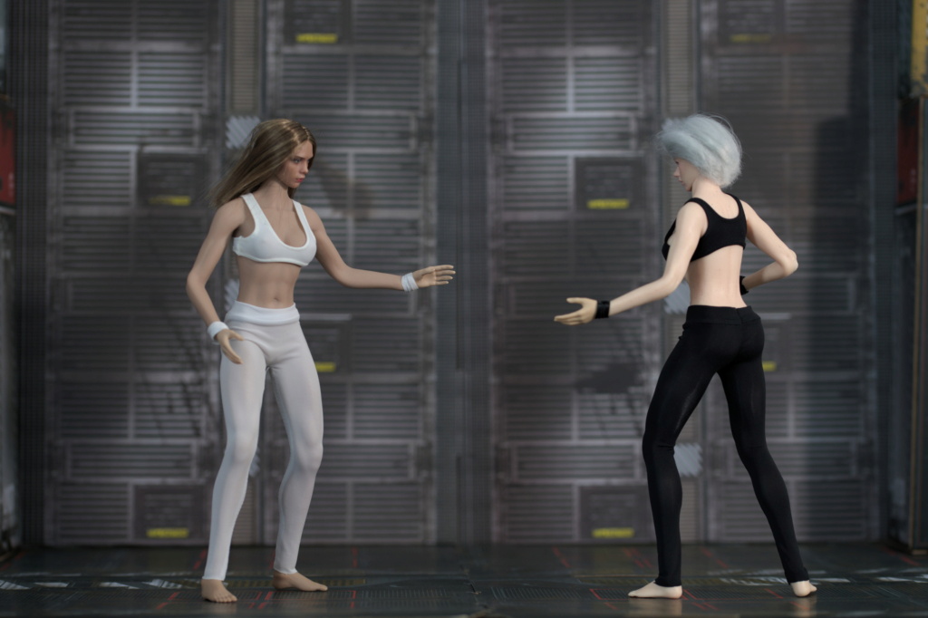

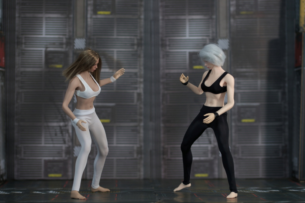
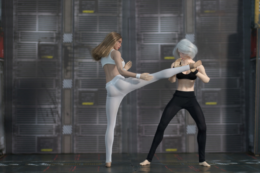




 Re: Visisonor's conjectures of grandeur (updated 2024-11-02) Sun Mar 17, 2024 6:25 pm
 Re: Visisonor's conjectures of grandeur (updated 2024-11-02) Sun Mar 17, 2024 7:51 pm
 Re: Visisonor's conjectures of grandeur (updated 2024-11-02) Mon Mar 18, 2024 7:11 am
 Re: Visisonor's conjectures of grandeur (updated 2024-11-02) Mon Mar 18, 2024 11:05 am
 Re: Visisonor's conjectures of grandeur (updated 2024-11-02) Mon Mar 18, 2024 12:41 pm
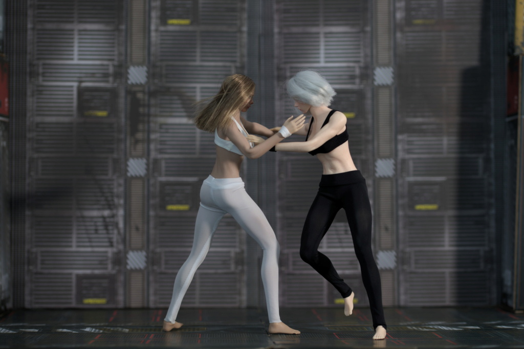
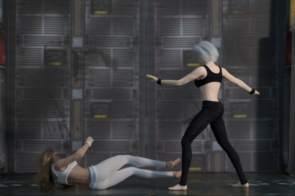
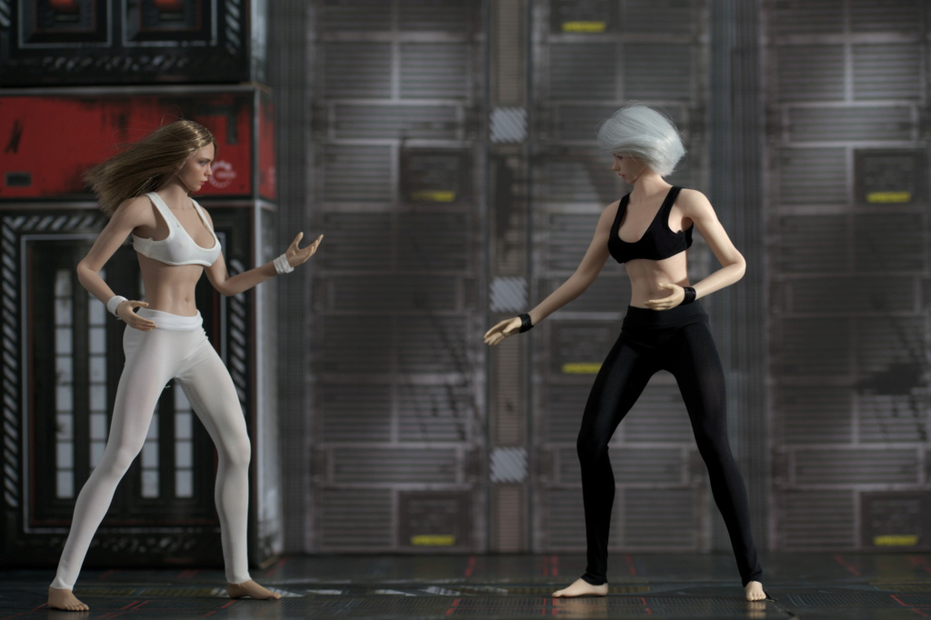
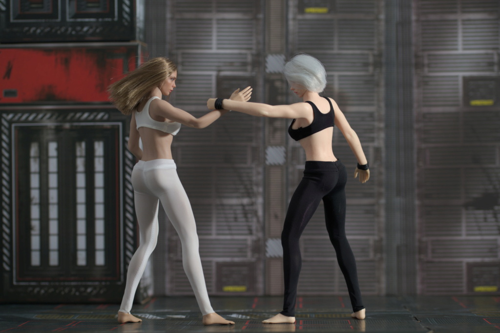
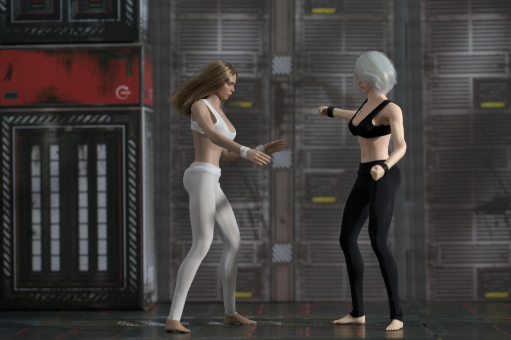
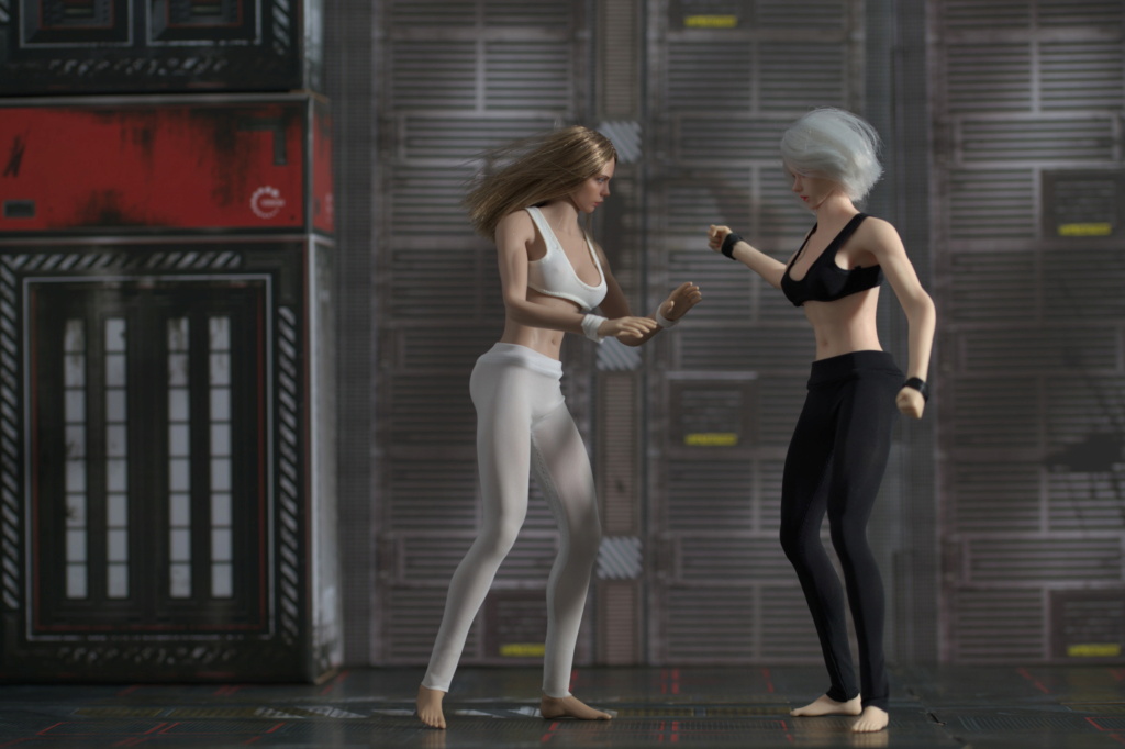
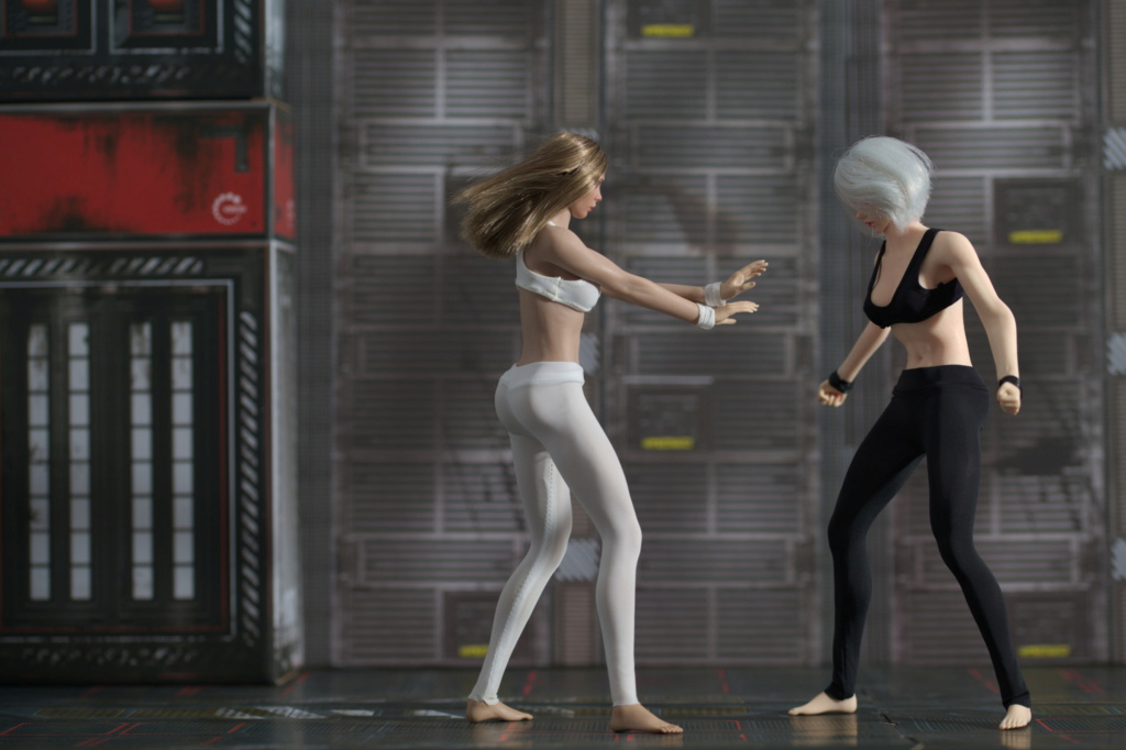
Stryker2012 wrote:There are a couple that look like real people.
Thanks! That's the goal, make them look like real people, at least to untrained eyeGubernatorFan wrote:in some of these they are very realistic.
Thanks! I'm trying to capture key poses which hint at some motion.BAMComix wrote:You captured the movement really well!
It will require a decimal order of magnitude more shots in between, with minuscule adjustments. I haven't tried that.Diana wrote:Have you ever made a stop motion film?
I've mentioned that in a post - articulation is better than that of 1/12 scale seamless figures, it does not limit poses I want to achieve. But working with larger figures is harder. I am somewhat used to figures fitting within my hands so I can get my figures around them and adjust them with small movements. With 1/6 scale, however, I have to move my hands around much more.Diana wrote:How was it to create this in 1/6 as opposed to 1/12?
 Re: Visisonor's conjectures of grandeur (updated 2024-11-02) Mon Mar 18, 2024 2:16 pm
 Re: Visisonor's conjectures of grandeur (updated 2024-11-02) Tue Mar 19, 2024 2:13 am
Valiarde wrote:Also liking the backdrop fits nicely into your world even though it makes the eyes not catch the scale of your figures. It could be 1/12 after all.


 Re: Visisonor's conjectures of grandeur (updated 2024-11-02) Tue Mar 19, 2024 9:31 am
 Re: Visisonor's conjectures of grandeur (updated 2024-11-02) Sat Mar 30, 2024 3:43 pm


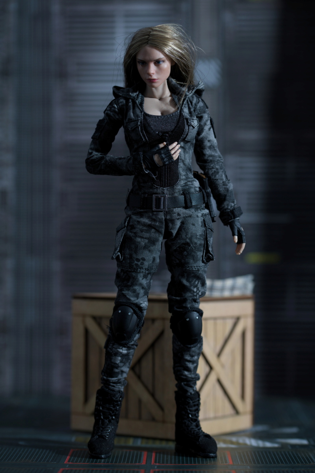

 Re: Visisonor's conjectures of grandeur (updated 2024-11-02) Sat Mar 30, 2024 3:54 pm
 Re: Visisonor's conjectures of grandeur (updated 2024-11-02) Sat Mar 30, 2024 4:17 pm
 Re: Visisonor's conjectures of grandeur (updated 2024-11-02) Mon Apr 01, 2024 3:52 am
BAMComix wrote:Your solution seems to work nicely
Thanks.GubernatorFan wrote:Not to mention, match her mini-her.
 Re: Visisonor's conjectures of grandeur (updated 2024-11-02) Mon Apr 01, 2024 7:56 pm
 Re: Visisonor's conjectures of grandeur (updated 2024-11-02) Tue Apr 02, 2024 4:25 pm
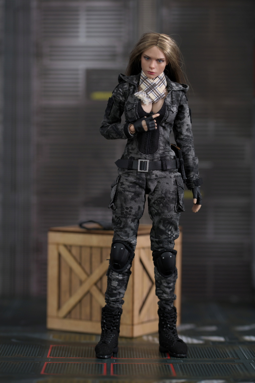
 The big bust on the VC body is so exaggerated that it actually hurts the overall look of the figure.
  Re: Visisonor's conjectures of grandeur (updated 2024-11-02) Wed Apr 03, 2024 2:44 am
Thanks.Stryker2012 wrote:Good way to adapt it to look more authentic.

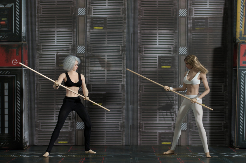
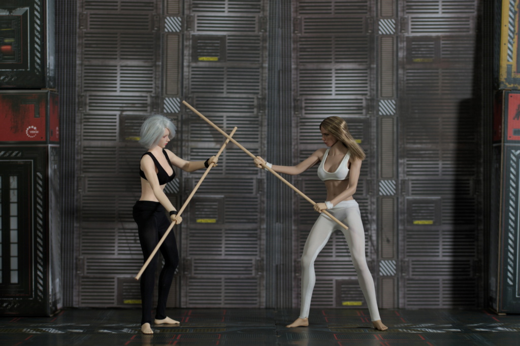
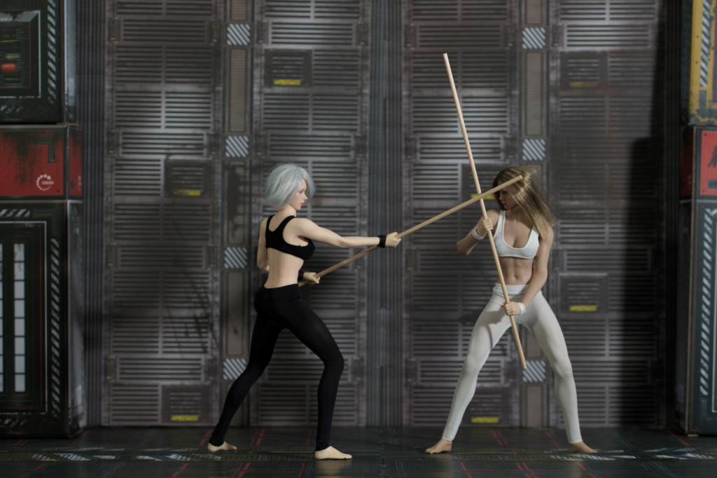
Thanks!Randam Hajile wrote:The fight scene is posed expertly!
I think it is exaggerated by the stock outfit and its cleavage, the bust itself mostly matches the size of TBL "medium"... Which is still quite big tbh, and since the female characters in my setting are based on 1/12 version of VC body or on similarly proportioned T01, they all ended up having "Boobs Of Steel"Randam Hajile wrote:I also like the addition of the top to Villa's outfit. ... The big bust on the VC body is so exaggerated
 Re: Visisonor's conjectures of grandeur (updated 2024-11-02) Sun Apr 07, 2024 3:15 am


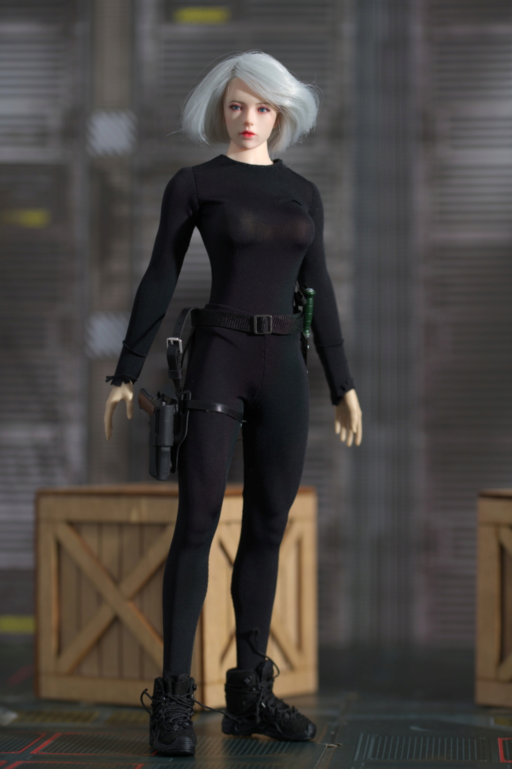
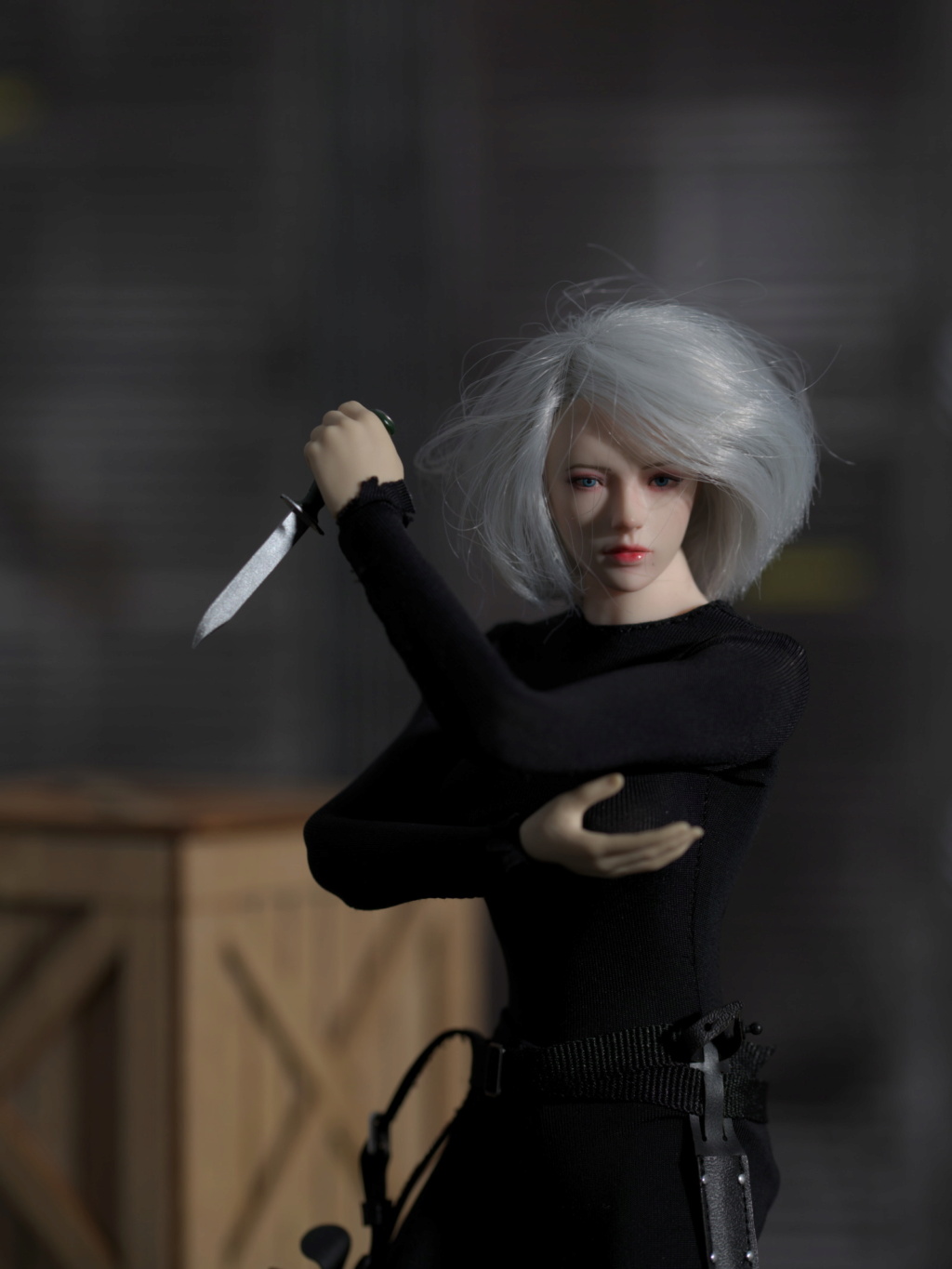
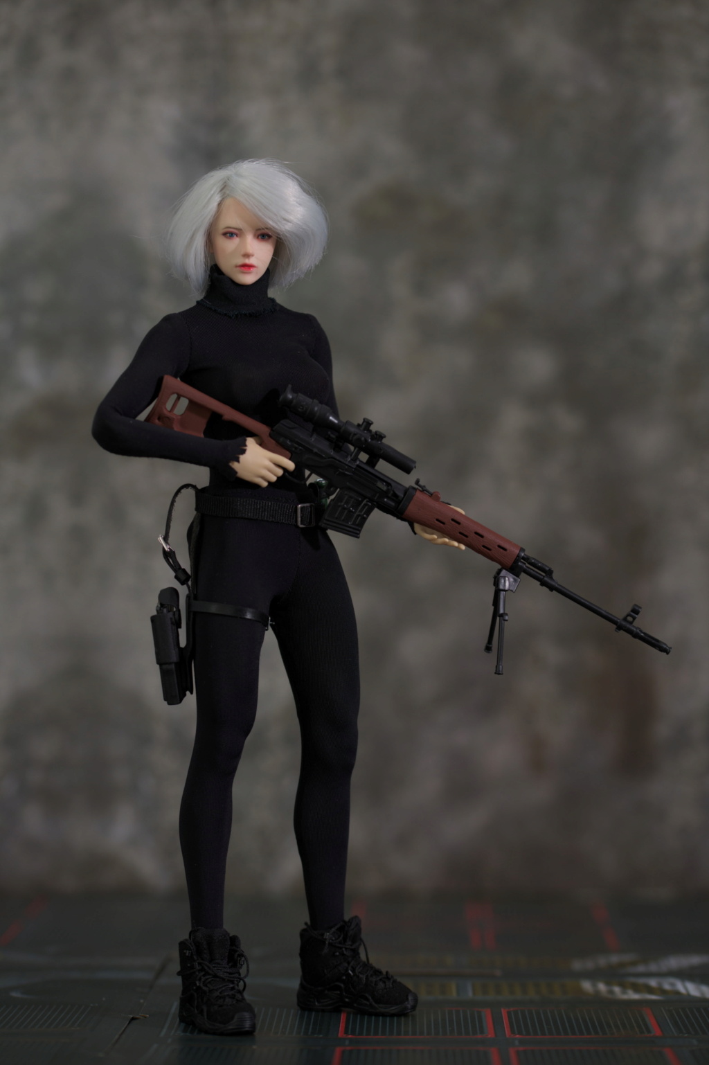



 Re: Visisonor's conjectures of grandeur (updated 2024-11-02) Sun Apr 07, 2024 7:05 am
 Re: Visisonor's conjectures of grandeur (updated 2024-11-02) Sun Apr 07, 2024 5:44 pm
 Re: Visisonor's conjectures of grandeur (updated 2024-11-02) Sat Apr 20, 2024 5:54 pm






 Re: Visisonor's conjectures of grandeur (updated 2024-11-02) Sat Apr 20, 2024 6:19 pm
 Re: Visisonor's conjectures of grandeur (updated 2024-11-02) Sun Apr 21, 2024 7:17 am
Go to page :  1, 2, 3, 4
Similar topics
Permissions in this forum:
You cannot reply to topics in this forum